An intuitive way-finding system for an imaginative healing garden in Starship children’s hospital.
Healeon began as a design-led response to a brief encouraging “Kiwis to participate and invigorate urban spaces with the concept of a future community garden.”
Through research, my team and I found that community gardens serve more than just being green spaces. We found that they can offer emotional support, especially in tough hospital environments.
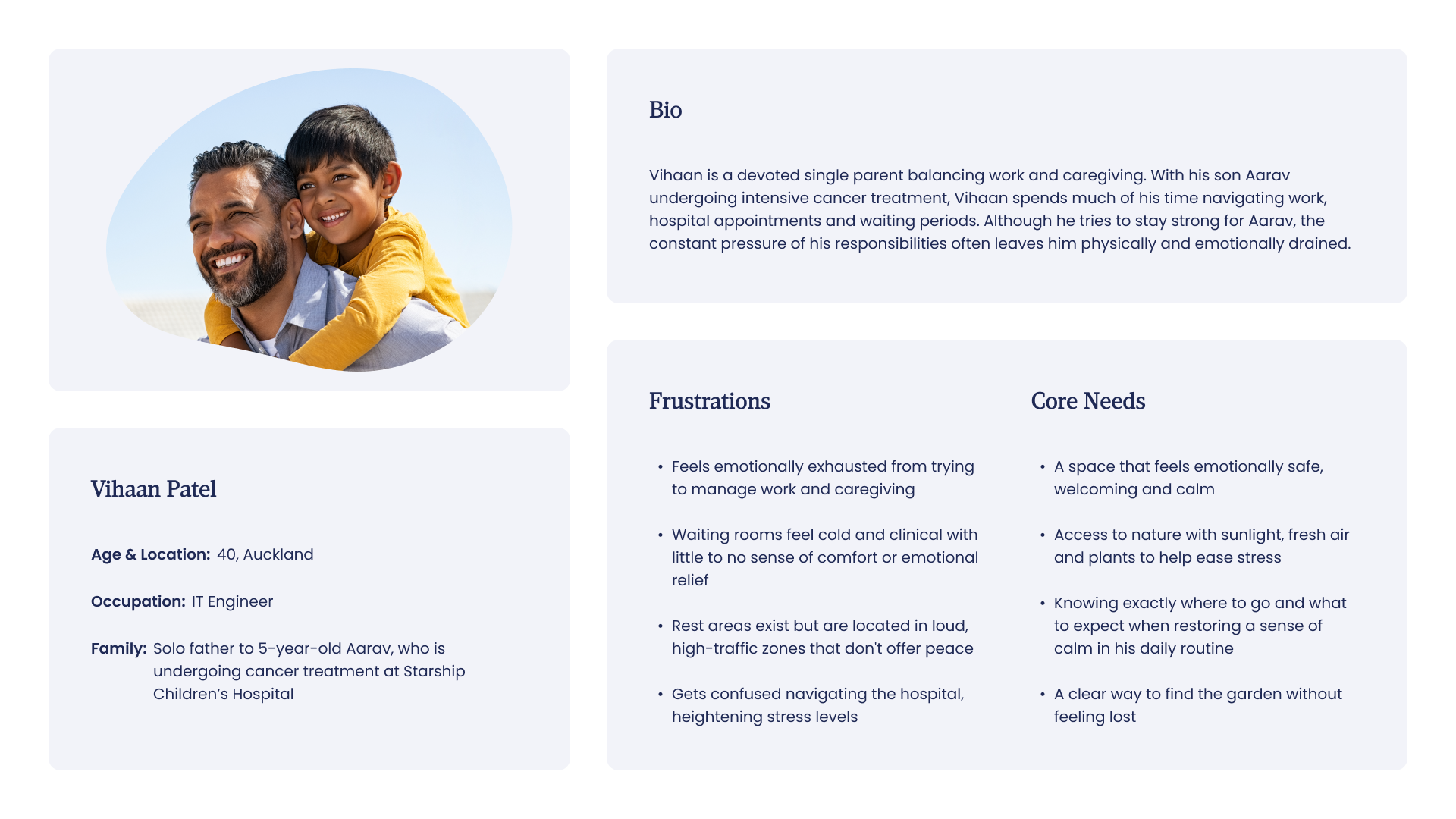
Caring for a critically ill child brings emotional, physical and psychological challenges to parents. As conditions worsen, uncertainty grows, intensifying distress and symptoms of burnout.
However, we found that these challenges don’t exist in isolation. They are often exacerbated by the very spaces families occupy while providing care.


To bring our idea to life, we identified Starship Children’s Hospital as a fitting location. Its core focus on paediatric care aligned perfectly with our goal of creating a garden that supports the emotional well-being of parents.
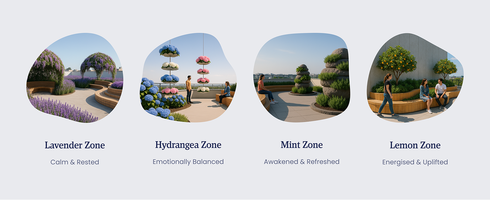
Following our on-site evaluation of the hospital, we thought best to reimagine the unused balcony on Level 4. Divided into four sensory zones, each space was designed to provide emotional relief through mood-specific planting.
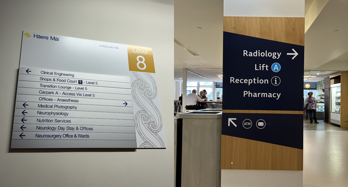
In large, clinical hospital environments like Starship, research has shown that it is easy for families to feel lost, both physically and emotionally.
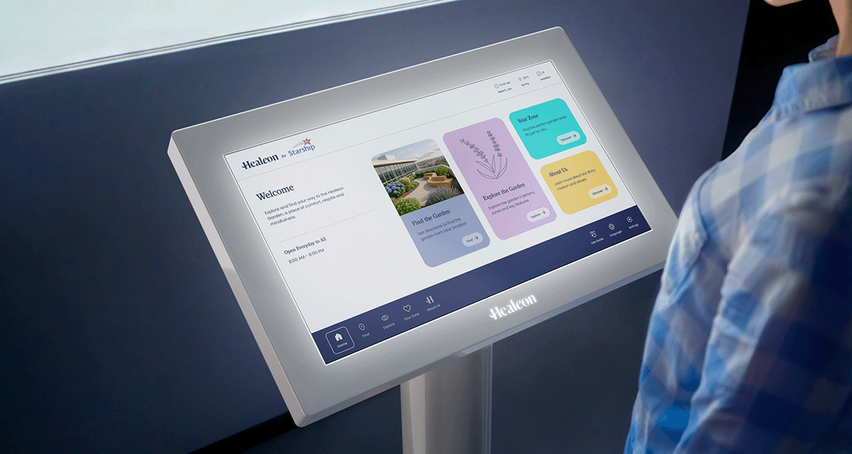
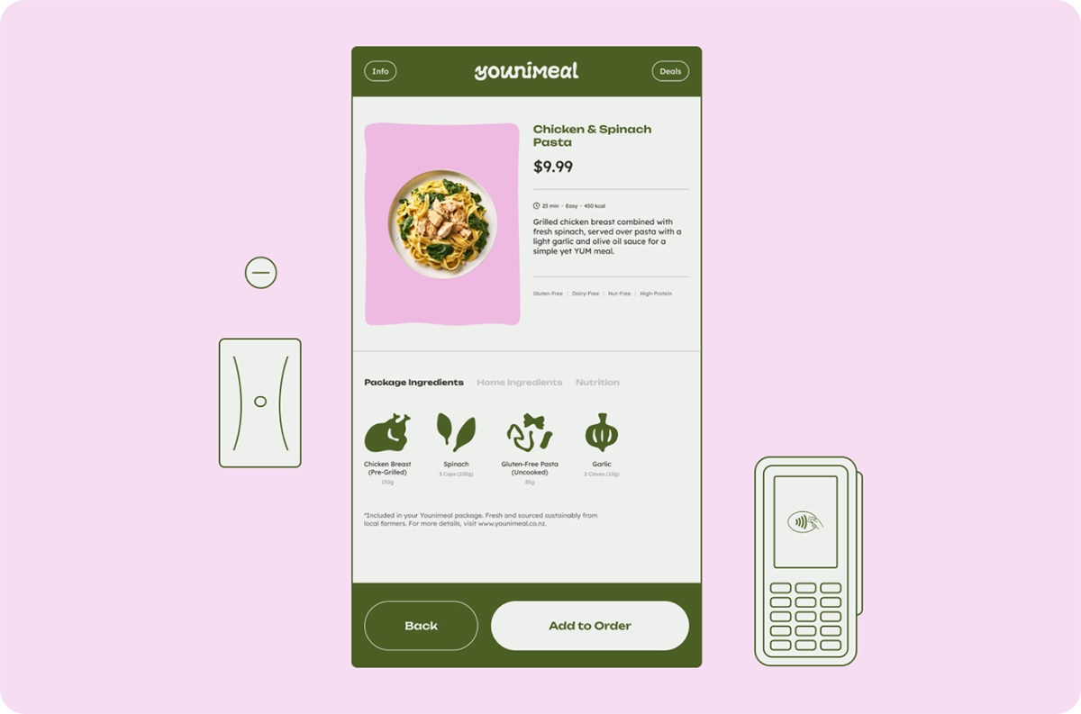
To address this challenge, I was tasked with designing the Healeon way-finding kiosk that offers simple guidance to our garden space on Level 4.

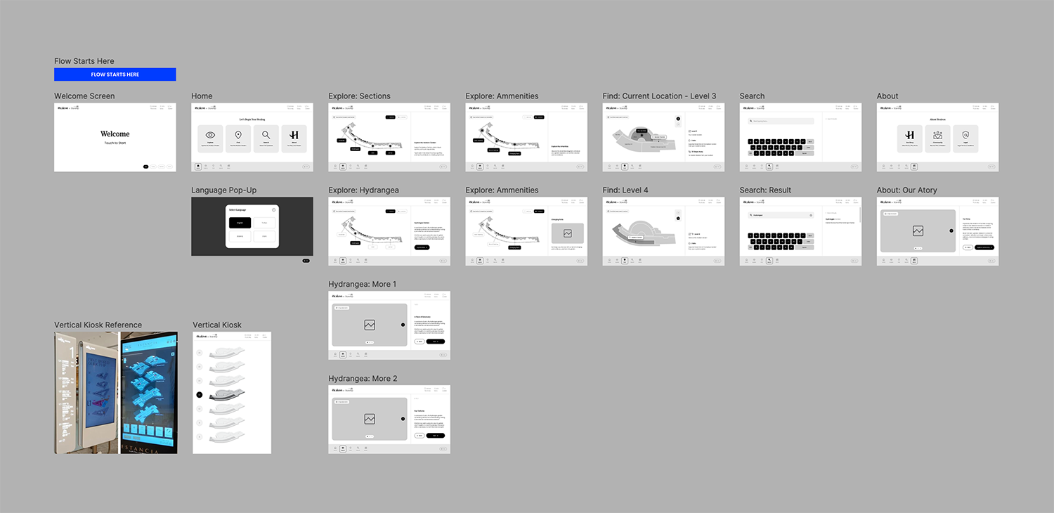
A step-by-step guide available in the bottom navigation to help users understand how to navigate the interface and its features at any time.
Providing the ability to adjust language and accessibility settings to better suit individual needs.
Helping users easily locate the Healeon Garden from their current location and view the estimated time and distance to reach it.
Enabling users to briefly explore different garden zones and amenities through a colour-coded map and detailed zone pages before their visit.
A quick questionnaire that matches users to the garden zone best suited to their current feelings and needs.
A direct invitation for users to learn more about Healeon’s story and mission.
To define our direction, we first studied the concept of community gardens. Research shows they are collective spaces for growing plants where they can foster connections, promote social equity and improve health and living conditions.
Despite these clear benefits, we discovered that many community gardens across Aotearoa are struggling to survive.

Beyond their original purpose of food cultivation, the role of community gardens has evolved. Emerging research has shown that community gardens, especially when placed in hospital environments, can offer new benefits.
Horticultural therapy is a specialised practice that uses gardening to promote healing across one’s physical, emotional and cognitive dimensions. Studies show it helps reduce anxiety and depression, often outperforming traditional recovery environments.
Although this approach typically supports patients, we realised a gap: the parents. While their children receive care, parents often carry emotional weight in silence.
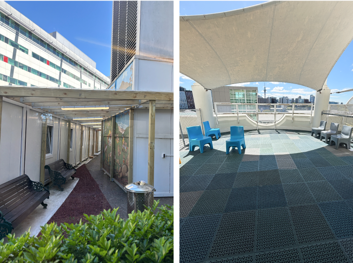
With Starship as our project site, my team and I explored inside where we were allowed access. While some areas offered moments of calm, few were truly suited for deep relaxation, further validating the need for our concept.
Given our brief was speculative and future-oriented, we selected a now-unused balcony on Level 4 to house our garden. The area was spacious and ideal for a new sensory escape.

We also researched into plants with emotional and therapeutic benefits that suited our concept. Our final selection were a series of four plants that were also safe and appropriate for a hospital setting.
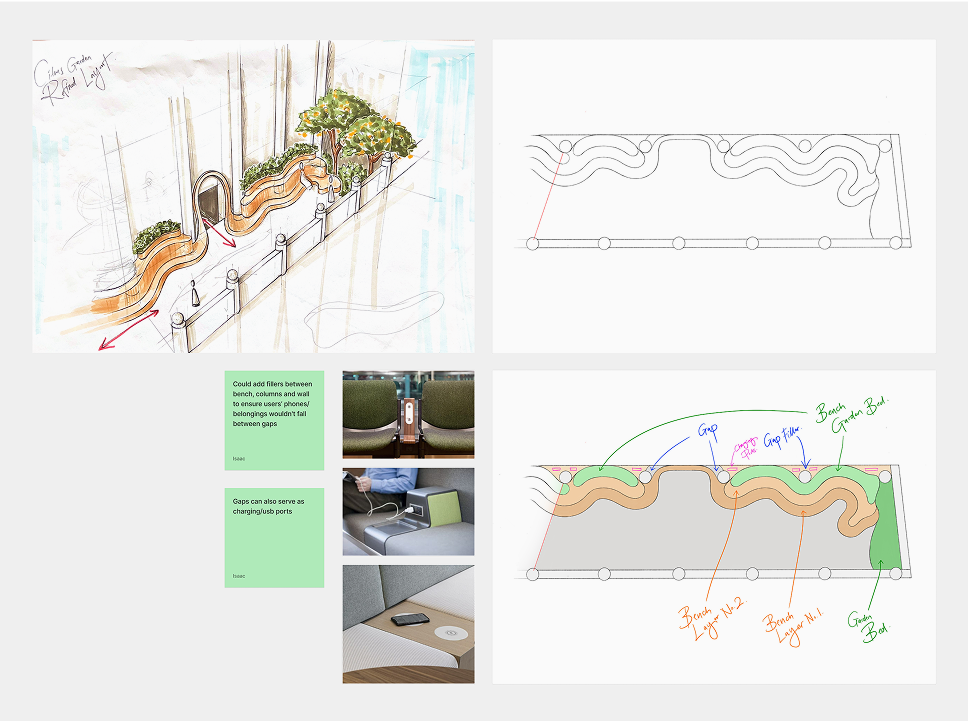
Everyone also contributed to the garden design, with mine being a large contributor. It was an enjoyable process that allowed us to think creatively and come back together as a team from individual tasks!
While proposing a relief garden felt like the right solution for supporting parents, we quickly realised the space itself wasn’t enough. Thinking as UX designers, we raised an essential question. How would anyone actually find this garden?
During an early site visit, our team member observed that Starship Hospital’s signage heavily focused on clinical services. However, there was no clear direction for non-clinical spaces like gardens or respite zones.


Having identified the need for a way-finding system, we shifted our focus to understanding the target audience. Since I was leading the digital kiosk design, I focused on uncovering the key challenges and navigation needs users might face in locating the garden.

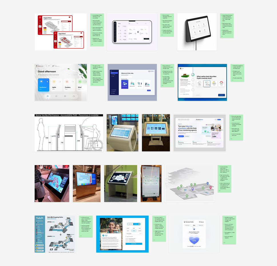
Having identified potential challenges and needs of our users, I explored online examples of tablet and way-finding kiosk screens to understand typical UI structures.
With no prior experience in way-finding design, this research laid the basic foundation on essential features I needed as well as layout ideas. From there, I sketched quick wireframes to map out the experience.
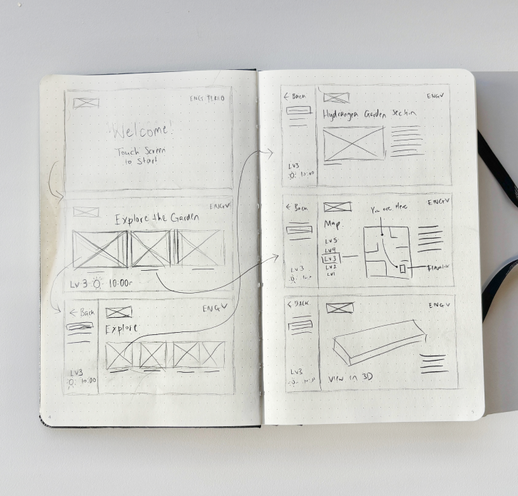

Despite this initial attempt, I was not fully satisfied as I felt things were missing. The screens lacked depth and I struggled to visualise a complete user flow due to a lack of full understanding in digital way-finding design.
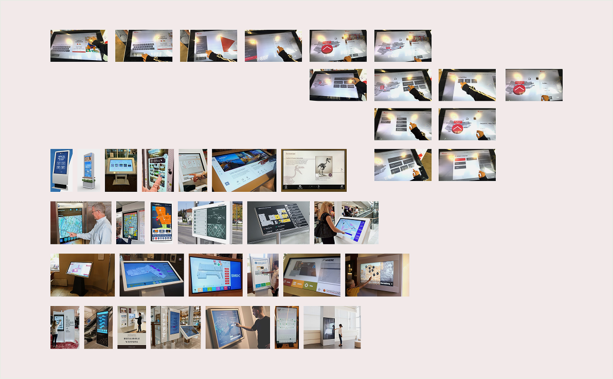
Thus, to improve, I conducted additional research, this time through hands-on observation. I visited a local mall to study physical way-finding kiosks and supplemented this with more online examples of kiosk screens.
Subsequent to this research, I made iterations to my initial information architecture. Through this process, I was able to better visualise the possible outcome as well as any structural changes needed in delivering the best experience to users.


Before I made any further iterations to the kiosk prototype, I conducted user testing with three participants. While there were notable positives, I gauged insights into key issues and areas for improvement:


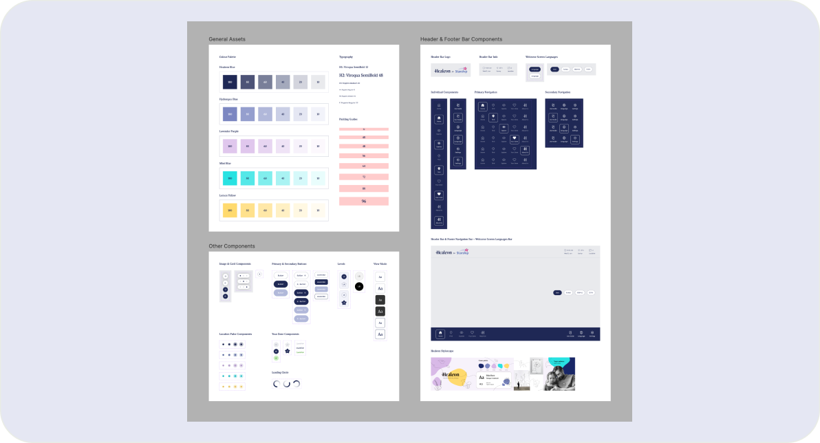
Finally, before moving into final production, I crafted a custom UI kit to ensure consistency across both our visual branding and the hi-fi prototype.
From the final round of user tests I conducted with the hi-fi prototype, all participants said the kiosk was easy to use, clean in UI and complimented our overall garden concept!
While proud of this outcome, I could have navigated this project differently by:
Through dabbling into way-finding design, this project taught me how to design with empathy and align digital tools with emotional, human needs. However, I believe there is still potential to push myself further.
If I had more time, I would love to explore...
An on-the-go vending solution for uni students to easily access cheap and healthy meal preps.
A digital-meets-outdoor adventure playground that encourages Kiwi tamariki to explore the natural world.